Brand & Visual Identity
Logos, brand systems, and marketing assets built for real products.
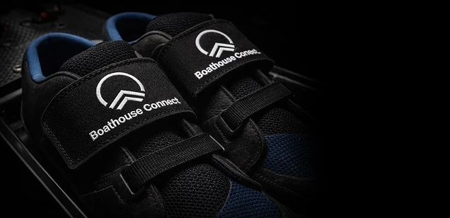
Boathouse Connect
01
Brand identity for a SaaS rowing club management platform. The product lives in two worlds, software dashboards and waterfront boathouses, so the mark had to work in both.
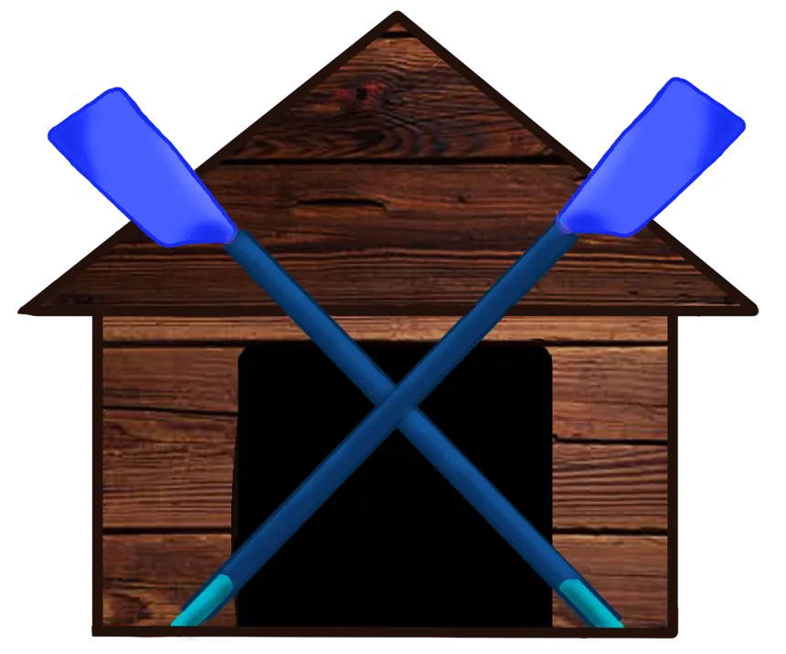
The original mark was a skeuomorphic illustration, wood textures, gradients, realistic oars.
It couldn't scale to a favicon, couldn't embroider on team gear, and couldn't adapt to sister products like Regatta Connect. The redesign needed to navigate the line between tech product and rowing sport: geometric enough for screens, bold enough for a boathouse wall.

Color
Three-color system.
Intentionally restrained: black, white, and one accent.
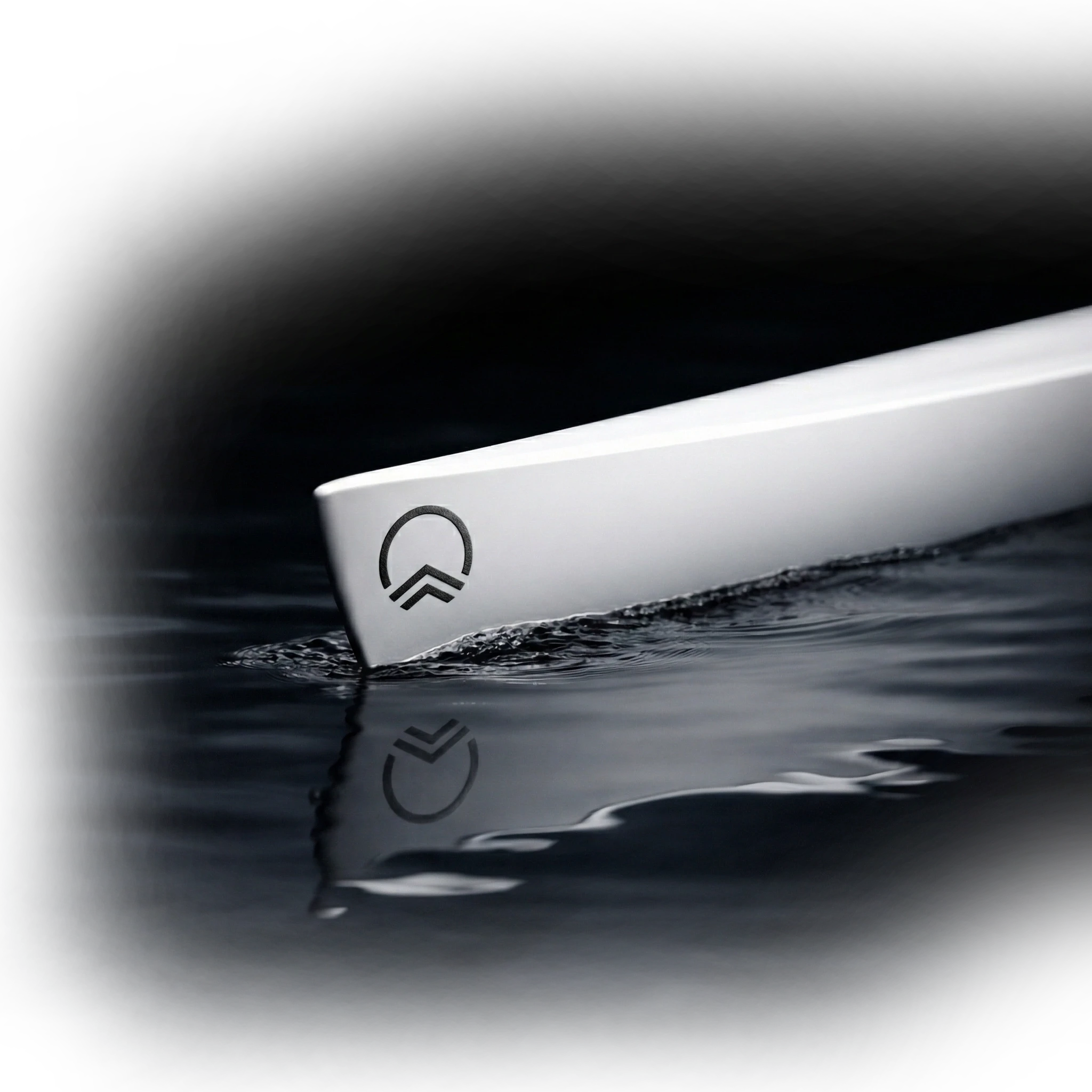
Logo System
Vertical, horizontal lockup, and mark only across all three backgrounds.


Regatta Connect
02
Brand identity and email templates for an online marketplace where rowing clubs and boat manufacturers rent unused boats during races — so visiting clubs can skip the logistics of bringing their own, and racers can test new equipment on the water.
Design Rationale
The identity needed to feel related to Boathouse Connect but have its own personality. I approached this on three levels:

The wordmark: heritage meets software
"Regatta" uses a hand-drawn cursive inspired by classic rowing club and university crests — warm, human, old-school. "connect" uses the same sans-serif as Boathouse Connect, signaling that the connection layer is software. The contrast is the point: tradition up top, technology underneath.


The icon: a shared shape, different expression
Both Boathouse Connect and Regatta Connect use a semi-circular arc inspired by the motion of rowing blades in sculling. Same structural element, slightly different style — enough to link the products as a family without making them identical.
The palette: distinct but adjacent
Boulder Blue (#1A2DD8) sits next to Boathouse's Accent Blue (#0074DE) — clearly different at a glance, but unmistakably in the same family. Both are blue, neither could be mistaken for the other.
Typefaces
Nunito for display headlines, Jakarta Sans for body — mirroring the wordmark's own tension between warmth and structure.
Colors
Brand colors plus a functional status vocabulary — confirmed entries, pending results, canceled races.
Highlight
Confirmed
Pending
Error
Warning
Logo
Wordmark and icon never appear together — wordmark where space allows, icon where it doesn't.


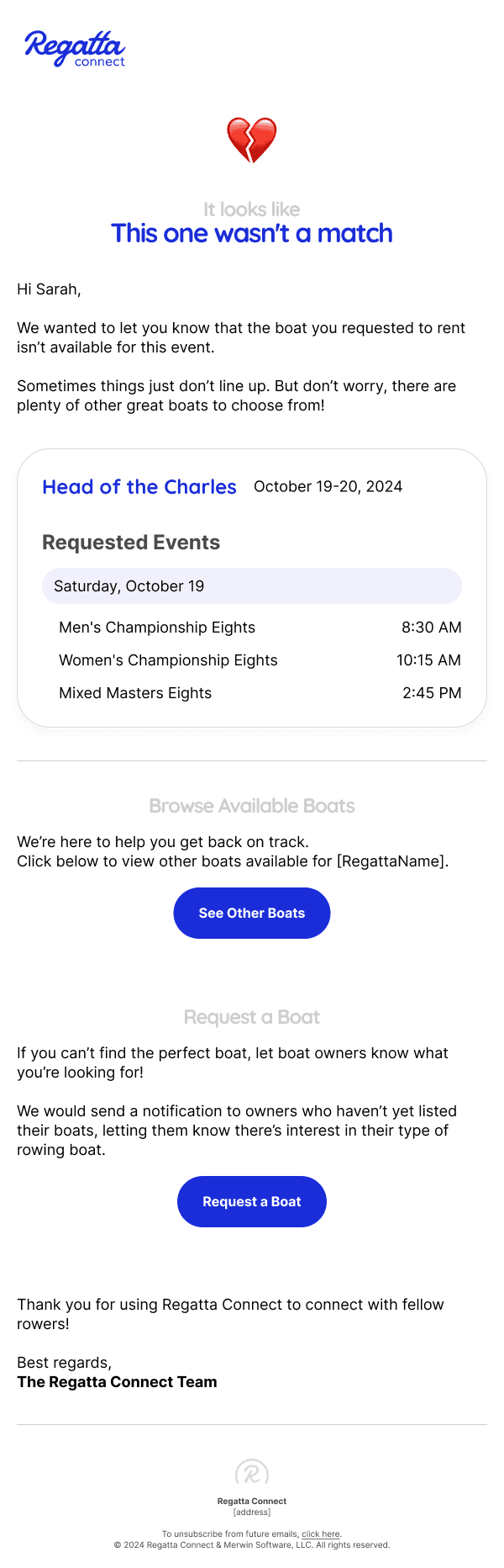
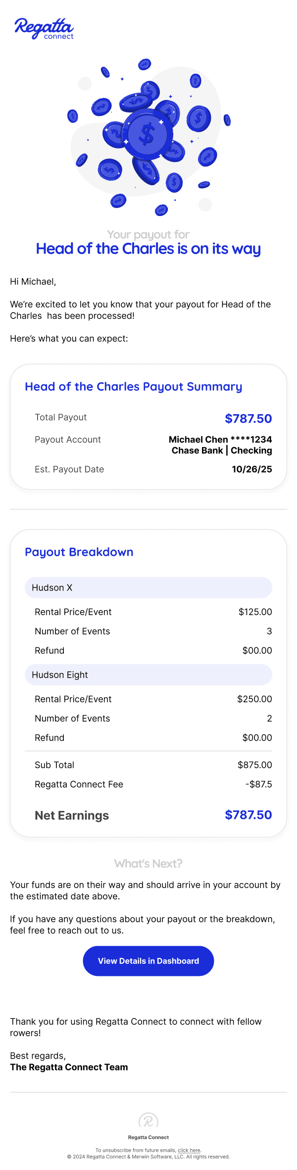
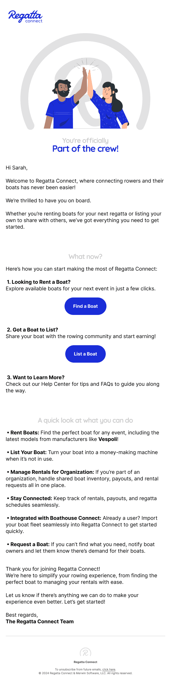
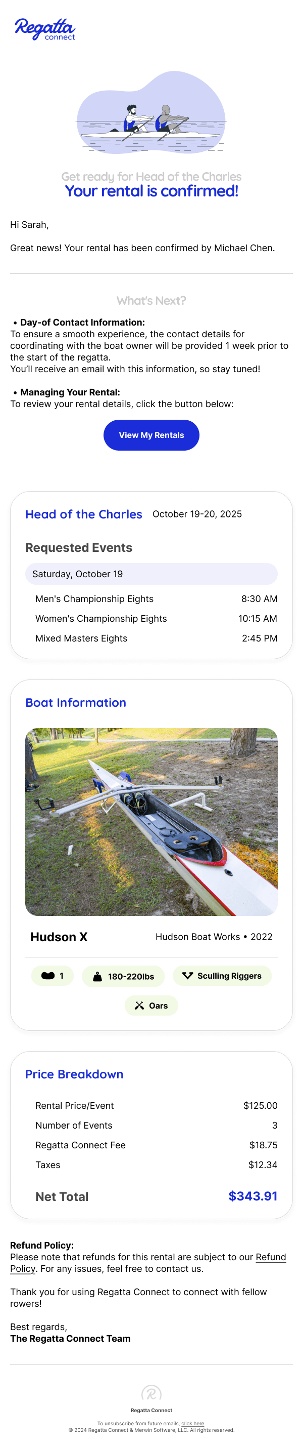
Brand in Production
The brand system applied to real deliverables — email marketing templates and the product's web experience. All assets designed in Figma and Affinity.
Email templates built for marketing campaigns — header layouts, CTAs, and status indicators all working within the brand guidelines.
Website prototype — the brand system scaled to a full product experience: navigation, hero, content hierarchy, and conversion flow.